Table of Contents
ToggleFormat Your eBook Like a Pro
Welcome to our blog on formatting your book like a pro!
Whether you are a self-published author or working with ebook writing services, the format of your book can make a big difference in how it is received by readers.
In this blog, we will share tips and tricks from experienced ebook writers on how to format your ebook for maximum readability and impact.
From choosing the right layout to optimizing your book for different e-reading devices, we will cover everything you need to know to take your book to the next level.
So, whether you are a seasoned author or just starting out, read on to learn how to format your book like a pro and the best ebook ghostwriting services.
Importance of Formatting Your Own Book

What’s more favorable to format a book on your own or ghostwrite?
First, it allows you to have complete control over the final look and feel of your book. It depends upon various factors inclusive of:
Choosing the font:
Selecting the perfect color, style, and size of the font matters when writing an ebook.
Choosing wisely is a crucial task and requires lots of time. Some of the most prominent and popular are:
Font Color:
Black and white is your greatest option since contrast between the foreground and background is essential to readability. Whether black-on-white or white-on-black is the best option depends on the font design. Most fonts used on personal computers were created for dark-on-light panels.
Font Style:
- Serif font Georgia is more used than the typical Serif Typeface for Headers and Subheaders.
- Sundays-Modern Serif Fonts are among the top fonts that are used for producing contrasted thickness and deep impression, increasing readability.
- Idealist Serif can be a perfect choice as it is easily readable for those who have eyesight issues, and it is blended up with a curlish style, giving it a more fancy look majorly for the romance genre.
- Fonts such as Comic Sans, Helvetica, and Coax can be used for informal, business, playful, readable, and high-contrast backgrounds to enhance them.
- Verdena is also one of the best fonts for reading, increasing readability by more than 90%, even in the smallest size.
- Branch is another excellent font from the family of Sans Serif with the most legibility, mostly used for headings or cover text rather than interior text.
Font Size:
- After playing and texting with many books, Calibri at size 14 is a perfect size. It’s a highly readable font size.
- Verdana at size 12 is another must, but for some places such as CTA’s, it could be 14-16.
- Arial at 12 also works to adjust around 300 to 350 words on a single page.
- Cambria at 13 to 15 is another addition to the cart because of its captivating and exotic look.
Layout:
- Focus on developing a clear and structured layout, choosing the right fonts and typeface, and using aesthetically pleasing photographs and graphics when designing an eBook.
- A typical ebook layout is one with a flowable font that can change in terms of size, symmetry, and style depending on the reader it is used on (often used as an electronic publication as well as PDFs). Since the overall design should improve the reading experience and match the information, PDFs are among the most popular file types for eBooks.
Fixed Or Reflowable Layout:
What is a better option?
“Fixed or reflowable layout for an ebook”
Fixed Layouts are those that are not able to change their fonts or move graphics according to readers’ choice. They look great in the genres of comic books, children’s novels, or graphic books.
Whereas Reflowable Layouts are those that change their fonts, size, style, and tone and are able to move graphics according to reader choice. Perfect for fiction, non-fiction, and poetries.
In short, these are just suggestions to format like a pro. Use what your heart says and your mind reads fast, or that best suits the tone and content of your book
Additionally, proper formatting can improve the readability and overall experience for your readers.
A well-formatted book is easy to read; with clear headings, sections, and chapters, making it easier for readers to navigate and understand your content. Furthermore, formatting is also important when it comes to e-books, as it helps ensure that your book looks good on different e-reading devices i.e. Kindles, iPads, Nooks, etc.
Overall, formatting your own book is a crucial step in the publishing process, it can save time, and help ensure that your book is well received by the readers and stands out in the market.
Tips to Format Your Book

While formatting a book can seem a daunting task, with the right tips, you can make the process a lot easier and more enjoyable. Here are some key tips to help you format your book.
1. Choose the Right Font
The font you choose can have a big impact on the readability and overall look of your book. Stick to classic, easy-to-read fonts like Times New Roman, Garamond, or Calibri. Use Black as the font color and 12 points as the size. These fonts have been proven to be the most readable and have been used in the printed book for ages. Avoid using overly decorative or fancy fonts, as they can be difficult to read and may detract from the content of your book.
2. Use consistent Formatting
Consistency is the key when it comes to formatting a book. Make sure to use the same font, spacing, and margins throughout the entire book. This will make your book look more professional and polished. Use the U.S. standard page size of 8.5×11 inches and set 1-inch margins on all sides.
For example, use the same font and size for chapter titles, headings, and subheadings. Use the same spacing between paragraphs and lines of text. Use uniform margins on all pages.
3. Use Headings and Subheadings
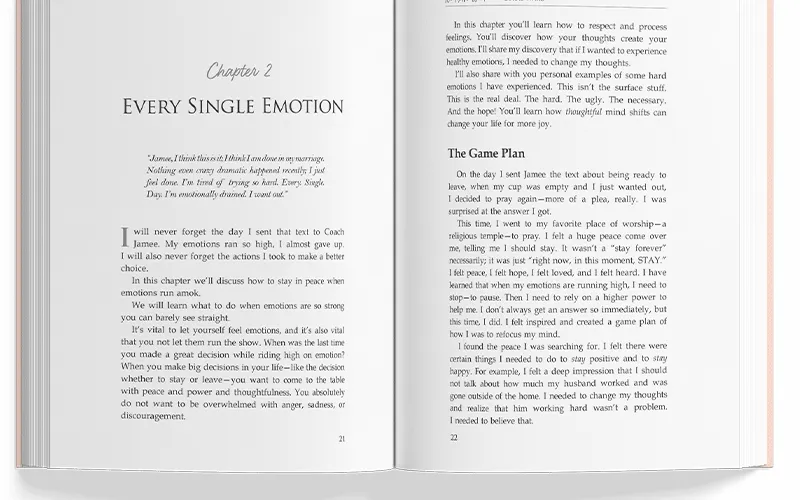
Headings and subheadings help break up your text and make it easier for readers to scan and understand your content. Use them strategically to guide your readers through your book. For example, use headings to organize different sections of your book and subheadings to break up large chunks of text. Use different formatting such as bold or italic, to make headings and subheadings stand out.
4. Use Images and Graphics
Images and graphics can help make your book appear more visually interesting and engaging. Just be sure to high-quality images that are relevant to you content.
For instance, if your book is about cooking, include photos of the dishes you describe. If your book is about historical events, include maps or illustrations. Be sure to include captions for images and graphics, to provide context and additional information.
5. Optimize for E-reading Devices
If you are publishing your book as an ebook, make sure to optimize the format for different e-reading devices. This will ensure that your book looks good on all devices and that the text is easily readable. This means using a compatible file format i.e. MOBI or EPUB and designing your book with smaller screens of e-reading devices in mind. This includes using a font size that is easy to read on a smaller screen and graphics that look good when resized.
6. Other Formatting Tips
Set justified alignment to left, use single space after periods and double-spaced line spacing. Instead of using Tab or Space to indent, indent all paragraphs by 0.5 inches. Number your pages and use page breaks where you wish to start a new page; instead of using Enter to create new pages.
If you are a fiction author, format your paragraphs according to genre standards. Then, when you are finally ready to submit your manuscript to your editor, send it as one single Word Document.
7. Get Feedback
Lastly, don’t be afraid to get feedback and reviews on your formatting from beta readers or professional editors. They can help identify any issues and make suggestions for improvement. Getting feedback from other people who are not as close to your project will give you a fresh perspective on the formatting and design of your book.
It is important to remember that the goal of formatting is to make the book as easy to read and understand as possible. In addition to these tips, it is also necessary to consider the overall design of your book. This includes things like the cover design, the layout of pages, and the colors you use in your book.
The cover of your book is often the first thing that potential readers will see, so it is important that it is eye-catching and reflective of the content of your book. The layout of the pages should be visually pleasing, with a balance of text, images, and blank white space.
Conclusion:
In conclusion, formatting your book like a pro is crucial for the success of your book, whether you are self-publishing or working with a traditional publisher. By following the tips outlined in this blog, you will be well on your way to creating a book that is both beautiful and easy to read.
If you are self-publishing and feel overwhelmed with the formatting process, consider working with professional eBook writing services like WebookX. This will enable you to format your book to industry standards and make sure it looks great on all e-reading devices.
You will also be provided editing, proofreading, and professional book cover design services to make your book stand out in the market and become a potential bestseller.
FAQs
Use consistent font and margins, divide content into clear sections and chapters, and include page numbers and a table of contents. Proofread multiple times to ensure accuracy.
It is best to use a classic font style like Times New Roman, Calibri, or Garamond; with the font size of 12.
It varies from genre to genre, storyline, story length, and many different factors, but at least it takes 6-12 months.
Every story somehow differs from others. Just write your heart and mind out, and it will be something that no one can write.
Yes, you can build your life story into a captivating narrative. Work closely with details, ensuring your entire experience is altogether effective in the digital world.